Showing posts sorted by date for query Behance. Sort by relevance Show all posts

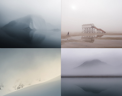
"MINIMAL LANDSCAPES"


"MINIMAL LANDSCAPES" |
"MINIMAL LANDSCAPES" by Northlandscapes, Jan Erik Waider. All photos featured in this project are part of larger series that you can find here on my Behance portfolio. Read more from this source.
•
Tags:

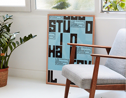
Studio Hauteville - Brand identity


Studio Hauteville - Brand identity — --> Read more from this source.

Tags: Behance Feature

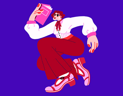
FemPalais Museum ? Exhibition illustrations


FemPalais Museum ? Exhibition illustrations — --> Read more from this source.
•
Tags: Behance Feature

Tangerine Dreams


Tangerine Dreams — — #hankenian is a curated journal on inspiring global design --> Read more from this source.
•
Tags: Behance Feature

Illustrations #hankenian is a curated journal on inspiring global design


Illustrations #hankenian is a curated journal on inspiring global design — --> Read more from this source.
•
Tags: Behance Feature

Ekies #hankenian is a curated journal on inspiring global design


Ekies #hankenian is a curated journal on inspiring global design — --> Read more from this source.
•
Tags: Behance Feature

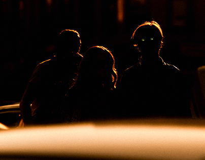
Hyundai ? N Vision 74 #hankenian is a curated journal on inspiring global design


Hyundai ? N Vision 74 #hankenian is a curated journal on inspiring global design — Our R&D project was an exciting exploration of using the magic of light, shadows and colors on the car. --> Read more from this source.
•
Tags: Behance Feature

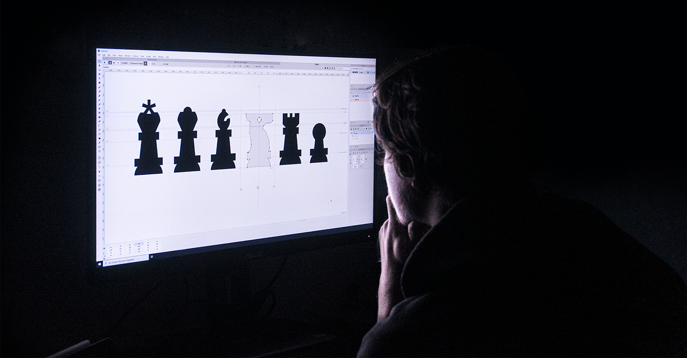
Chessvetica Chess-Themed Typeface


Themed Chess Typeface and Webfont designed to improve the way people see and write about chess online. With swiss-style chess pieces as glyphs and chess annotations themed to fit the traditional popular swiss type movement, Chessvetica offers a unique visual experience for chess enthusiasts. Chess is a game of strategy and intellect, and it has always held a special place in the world of typography. To celebrate this connection, Chessvetica combines the elegance of the Helvetica typeface with the beauty of the chess world. The result is a one-of-a-kind typeface that captures the essence of the game. One of the key features of Chessvetica is its use of swiss-style chess pieces as glyphs. Each letter of the alphabet is represented by a different chess piece, adding a touch of creativity to your words. Whether you're writing an article, a blog post, or even a chess-themed story, Chessvetica allows you to incorporate the spirit of the game into your typography. In addition to the chess-themed glyphs, Chessvetica also includes chess annotations that are designed to mimic the style of popular swiss type movement. These annotations not only enhance the visual appeal of your chess-related content but also make it easier for readers to follow along with the moves and strategies being discussed. Chessvetica is not just a typeface, but also a webfont. This means that you can easily incorporate it into your website design, giving your chess-related pages a cohesive and eye-catching look. Whether you run a chess blog, a chess tutorial website, or an online chess platform, Chessvetica can elevate the visual experience for your users. To showcase the beauty and versatility of Chessvetica, it is best experienced in action.

You can find examples and more information about Chessvetica on the Behance link here: https://www.behance.net/gallery/135170991/Chessvetica-Chess-Themed-Typeface

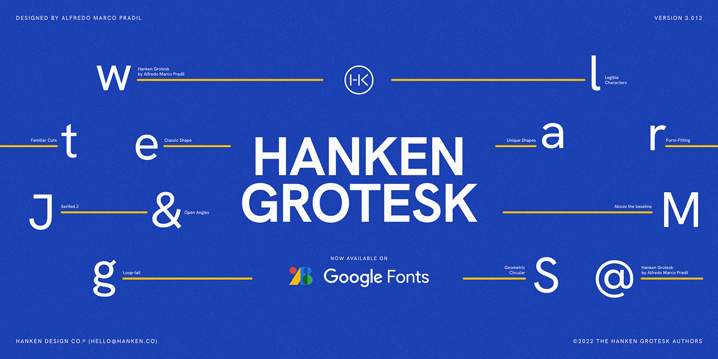
Exploring the Hanken Grotesk Typeface: A Modern and Versatile Choice


In the world of typography, the typeface you choose can greatly impact the overall look and feel of your design. One such typeface that has been gaining popularity among designers is Hanken Grotesk. With its modern and versatile characteristics, Hanken Grotesk offers a fresh approach to typography that captivates the audience. Hanken Grotesk, created by Alfredo Marco Pradil, is a sans-serif typeface that beautifully combines simplicity and elegance. Its clean lines and geometric shapes contribute to a minimalist aesthetic, making it suitable for a wide range of design applications. One of the standout features of Hanken Grotesk is its versatility. It has a variety of weights, ranging from thin to bold, allowing designers to experiment with different visual weights in their compositions. This flexibility makes it an ideal choice for a range of projects, including branding, editorial design, web design, and more. Another reason why Hanken Grotesk has caught the attention of designers is its excellent readability. The clear and balanced letterforms ensure that the text is easy to comprehend, even at smaller sizes. This makes it a practical choice for body text in various design projects, ensuring that the content remains accessible and legible. Furthermore, Hanken Grotesk is a typeface that blends well with other fonts. It can be paired harmoniously with serif, script, or display typefaces without losing its distinct personality. This flexibility allows designers to create captivating visual compositions and establish a unique brand identity. The Hanken Grotesk typeface offers a clean and contemporary look that resonates with modern audiences. Its versatility, readability, and ability to blend seamlessly with other fonts make it a valuable asset for any designer's toolkit. 

Whether you're working on a print design, a digital project, or anything in between, consider exploring the Hanken Grotesk typeface and unlock its creative potential. Image Source: Behance (https://www.behance.net/gallery/158970413/Hanken-Grotesk-Typeface)