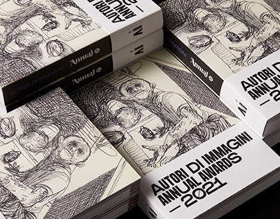
Autori di Immagini: Annual Awards ? 2021 |

The redesign of Annual Autori di Immagini 2021 was developed preserving the editorial structure from the previous editions while introducing various innovations in terms of typography, layout, colors and paper choice. For the typographical composition of the paragraphs we preferred Atlas Grotesk by Commercial Type, a highly legible sans typeface, designed for editorial use. On the other hand, for titles, we decided to design the headline font from scratch: SB Lustro, a condensed sans with a strong personality. The font have a slight reverse contrast and is characterized by the presence of an alternative stylistic set for capitals. During the restyling process we reduced the number of colors to four: the white of the paper, the black of the ink and, lastly, indigo and magenta, a tribute to the institutional colors of Autori di Immagini. At the same time, a careful work of synthesis of the stroke was carried out, giving life to the portraits of the jurors designed by Marco Goran Romano. Read more from this source.
•
Tags:

No comments:
Post a Comment